My take on CSS-GRID : PART 2
Hey people, this is the part 2 of the article on CSS-Grid
Published
•5 min readHey people, Welcome to the part-2 of the article on css-grid.
Let's play around with the properties of grid-items
- The properties we generally use with the grid-items are as follows
1). grid-column
2). grid-row
3). grid-area
4). align-self
5). justify-self
1). grid-column
- This property defines to which columns the grid-items are to be placed. If we write
grid-column : 1/4;than the item starts from column 1 and end before column 4. We can also write like thisgrid-column : 1/span 3, it means item start from column 1 and span 3 columns. - Let's understand with a code snippet. In the below example the start from column 1 and end before column 3. This property can be used as shorthand for
grid-column-startandgrid-column-end.
[Codepen]
2). grid-row
- This property defines to which rows the grid-items are to be placed. If we write
grid-row : 1/4than the item will start from row 1 and end before row 3. Similarly, here also we can writegrid-row : 1/ span 3. Let's understand this with a code snippet. - In the below example the item start from row 1 and end before row 3. This property can be used as shorthand for
grid-row-startandgrid-row-end.
[Codepen]
3). grid-area
- This property can be used as shorthand notation for
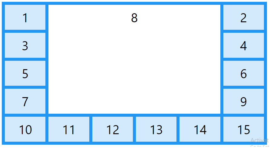
grid-row-start,grid-column-start,grid-row-endandgrid-column-end. If we writegrid-area : 1/2/3/4;than the item will start from row line 1 and column line 2 and end on row line 3 and column line 4. You might be thinking what is row and column lines ?. Row and column lines are gap between two items. In the below figure the vertical dark blue lines are called column lines and the horizontal dark blue lines are called row lines.
- This property can also be used to assign names to the grid-items. We have already discuss this in the
grid-template-areaproperty of grid-container. Let's look at the example in which item 1 start from row line 1 , column line 2 and end at row line 3, column line 4.
[Codepen]
4). align-self
This property specifies alignment for the selected items inside the grid-container in the vertical direction. This property overrides the align-items property of the selected grid-items. The values this property can take are as follows
a). start
b). end
c). center
d). stretch
Let's discuss this property with a code snippet.
[Codepen]
5). justify-self
- This property specifies alignment for the selected items inside the grid-container in horizontal direction. This property overrides the justify-content property of the selected grid-items. The values this property can take are as follows.
a). start b). end c). center d). stretch - Let's discuss the property with a code snippet.
[Codepen]
So, here the properties of grid-items gets over. There are few more properties which you can learn on MDN documentation. Or you can ask me to cover a specific property, just comment below and I will write an article about that property. I would love to help you guys.
Let's go to the conclusion 😃.
Conclusion.
- So if you want to align items in two dimension we need to use grid, right ? Let me make you more clear on it with an example. In the below example I have used flex-layout in the container 1 and grid-layout in the container 2.
- In container 1, I have given the flex properties such that the items inside the container grow and shrink from the basis of 100px. I have also given
flew-wrap:wrapproperty so that if the container goes narrow than the items inside the takes up the new row two maintain theflex-basisproperty - In container 1, if you narrow the container than the items insides the container will go on to the new row and will occupy the available space but the items which is on the new row will not be underneath with the above items. So a question might be arising in your mind than how to make those items exactly underneath of the above items, right ?. Think yourself....!!!! 😂( aah... I'm kidding ). So here where two dimension layout comes into place.
- In the container 2 I have created 3 columns of 1fr using grid each You can check the grid layout I have used in the container 2. Hope you know what is container and what are items 🤔 ? if you don't read my article on CSS-flexbox or you can google it 😎.
- Hope you understood the above points. so are you excited. Let's visualize the above discussed points with a code snippet.
[Codepen]
That's a wrap
- So, here we are done with this article 😎. If enjoyed please appreciate my work by liking or you can comment any suggestion to improve my article.


