CSS Layout - Flexbox
Published
•9 min read
What is Flexbox ?
- Flexbox is a one dimensional layout method for arranging items in rows and columns and it provides us powerful alignment capabilities. Flexbox has made our life much easy because before flexbox the cross browser compatible tool available for CSS layouts were
floatsandpositioningwhich were somewhat limiting.
Why we use Flexbox ?
- The methods available before where somewhat making it difficult or impossible to achieve the following simple layout designs.
- To distribute equal amount of available height/width to the children regardless of how much height/width is available.
- To be able vertically center a block inside the container.
Before starting to discuss about different properties of flexbox let's learn few terms which will help us in further discussion.
Flex container and Flex items
- The flex container is the element that holds flex items. Flex items are direct children of flex container. For example
<div class="flex-container">
      <div class="item">Flex Item 1</div>
      <div class="item">Flex Item 2</div>
      <div class="item">Flex Item 3</div>
  </div>
The Axis
- There two axis when it comes to flexbox which is very necessary thing to have an idea about it.
- Main Axis and Cross Axis.
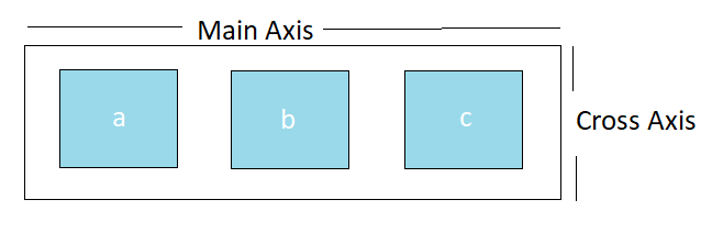
Main Axis
- While using the flexbox property
flex-direction : row or flex-direction : row-reversewe consider the main axis and cross axis as shown in the following diagram.
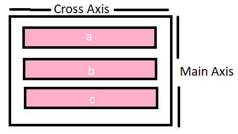
- While using the flexbox property
flex-direction : column or flex-direction : column-reversewe consider the main axis and cross axis as shown in the following diagram
- Therefore, we can say that the
main-axiswill run in the direction offlex-directionwhile thecross-axiswill run perpendicular to themain-axis.
Let's discuss few more points before starting with the properties of flexbox.
- First of all we need to select which elements are laid out to be as flexible box. After selecting those elements we will set a special value of
displayon the parent of the elements which we wants to get affected. - The special value of
displaywe will be using to align items in the flex-container isdisplay : flex. Let's understand this with an example.
[Codepen]
Now, let's discuss about the properties of flex-container and flex-items
Flex-container Properties
1. Flex-direction
- The flex-direction property defines how the flex-items(direct child) are placed in the flex-container(Parent) defining the main-axis and the cross axis. The flex-direction has four values. The default value is
flex-direction:row- row (default value)
- row-reverse
- column
- column-reverse
- Let's understand this with an example.
[Codepen]
2. Flex-wrap
- The flex-wrap property defines whether the flex-items are forced onto one line or they can wrap onto multiple lines. The flex-wrap has three values. The default value here is
flex-wrap : nowrap.- wrap : The flex-items will wrap onto multiple lines.
- nowrap : The flex-items are forced onto one line only.
- wrap-reverse : The flex-items will wrap onto multiple lines but in reverse order.
- Let's understand this with an example.
[Codepen]
3. Justify-content
- The justify-content property defines how to distribute space between and around the flex-items along the direction of the main axis. The default value is
justify-content:flex-start. The values for justify-content are as follows.- flex-start : The flex items are packed together and they move towards the start edge of the alignment container in the main axis.
- flex-end : The flex items are packed together and they move towards the end edge of the alignment container in the main axis.
- center : The flex items are packed together towards the center of the alignment container in the main axis
- space-between : The flex items are evenly distributed within the alignment container along the main axis. The first item is flush with main-axis start edge and the last item is flush with the main-axis end edge. The space between each pair of adjacent flex-items is same.
- space-around : The flex items are evenly distributed within the alignment container along the main axis. The spacing between each pair of the adjacent item is same. The empty space before the first and the last item is equal to the half of space between each pair of the adjacent item.
- space-evenly : The flex items are evenly distributed within the alignment container along the main axis. The spacing between each pair of adjacent items, the start-edge of main axis and the first item, the end-edge of main-axis and the last item is same.
- Let's understand this with an example
[Codepen]
4. Align-items
- The align items property defines how items are laid out on the cross-axis. The default value is
align-items : stretch.The values for align-items are given below- Stretch : This is default value in which the items stretch to fill the container along cross axis.
- flex-start : The items are packed together and are put at the start of the cross axis.
- flex-end : The items are packed together and are put at the end of the cross axis
- center : The items are packed together and are put at the center of the cross axis
- baseline : The items are aligned such as their baseline align. Baseline is the line upon which the letters sit. If the size of the content inside the items is same than
flex-startandbaselineacts as same but if the size of the content is different in the items than we will see noticeable difference inflex-startandbaseline.
- Let's understand this with an example.
[Codepen]
5. Align-content
- The align-content property define how space-between and space-around are distributed among the items in the container along the cross-axis. The values of align-content are as follows.
- flex-start : The flex items are packed together and they move towards the start edge of the alignment container in the cross axis
- flex-end : The flex items are packed together and they move towards the end edge of the alignment container in the cross axis
- center : The flex items are packed together towards the center of the alignment container in the main axis
- space-between : The flex items are evenly distributed within the alignment container along the cross axis. The first item is flush with cross-axis start edge and the last item is flush with the cross-axis end edge. The space between each pair of adjacent flex-items is same
- space-around : The flex items are evenly distributed within the alignment container along the cross axis. The spacing between each pair of the adjacent item is same. The empty space before the first and the last item is equal to the half of space between each pair of the adjacent item
- stretch : The flex items are stretch to take up all space in the direction of cross axis.
- Let's understand this with an example
[Codepen]
6. Gap
- The gap property defines the row-gap and column-gap between the items inside the container. Let see an example.
.container {
display: flex;
gap: 10px;
gap: 10px 20px; /* row-gap column gap */
row-gap: 10px;
column-gap: 20px;
}
[Codepen]
Flex-item properties
1. Order
- The items in container are laid out in the source order. The order property controls the order in which they appear in the flex-container. All items have
order : 0by default. Let's understand this with an example.
[Codepen]
2. Align-self
- The
align-selfproperty allows us to override default alignment or the one specified by the align-items for the individualflex-items. All the value we apply foralign-itemswork here also but for the individual items. Let's understand this with an example.
[Codepen]
3. flex-grow
- The flex-grow property dictates what amount of available space inside the container a flex-item should take. It defines the ability of flex-items to grow if necessary. It accepts a unitless value and treat it as a proportion. All items inside the container has default value as
flex-grow : 0. It does not accept the negative values. Let's understand this with an example.
[Codepen]
4. flex-shrink
- The flex-shrink property defines the ability of flex-items to grow if necessary. All items inside the container has the default value as
flex-shrink : 1. It does not accept any negative values. If the size of the items are larger than the container the flex-shrink property make all items shrink to fit the container. Lets understand this with an example.
[Codepen]
5. Flex-basis
- The flex-basis defines the default size of the items before the remaining space is distributed. It can be a length or a keyword. Let's understand this with an example.
[Codepen]
6. Flex
- This is the shorthand for flex-grow, flex-shrink and flex-basis combined.
- If there is only one value and it is unitless than
flex : flex-growandflex-basis : 0. - If there is only one value and it is width/height than
flex : flex-basis. - if there are two values and one is height/width and other is unitless than
flex : flex-grow flex-basis. - if there are two values and both are unitless than
flex : flex-grow flex-shrink. - if there are all the three values than
flex : flex-grow flex-shrink flex-basis. - Well this the end of this particular article. This was the longest article I have written till now so please give your few minutes to have a look at it and give your feedback in the comments to improve my writing style. Stay tuned for more.


